Project Contributions:
Color • Treatment Application • Print Art Direction • Trend Research
Color planning for Planetbox balances broad age appeal with seasonal freshness. With a customer base that spans children ages 4-12, color and print usage must accommodate a wide range of tastes. The strategy also considers the coordination between softline accessories and hardgoods to create cohesive sets. To maintain freshness while managing inventory, Planetbox undergoes a color refresh every other year—retaining core brand colors while introducing new trend colors.
Project Contributions:
Color • Treatment Application • Trend Research
Wine trends lean toward heritage and classic aesthetics, so we explore new treatments, metal finishes, and updated neutrals to refresh our core wine assortment while maintaining a timeless feel. For seasonal or more accessibly priced products, we incorporate trend-forward colors alongside neutrals to create a dynamic and appealing range. I work closely with our manufacturing partners to ensure that color and finish applications align with brand standards across all product tiers.
Project Contributions:
Print Creation • Color • Treatment Application • Trend Research
As part of a collaboration with Dictator Lunches, the popular children’s lunch Instagram account by Jenny Mollen, I developed a custom print and color palette for Planetbox timed to the launch of her new children’s lunch cookbook. The design was tailored to reflect Jenny’s playful, irreverent tone while aligning with Planetbox’s brand aesthetic. The coordinated product launch coincided with her book release, creating a cohesive, limited-edition offering that celebrated creative lunch-making for kids.
My most recent trend report for key accounts is a comprehensive compilation of global research, drawing insights from shopping trips in London, Paris, Tokyo, and Seattle, as well as trend analysis from major trade shows including Shoppe Object, Maison & Objet, and Ambiente.
Project Contributions:
Presentation and Render Art Direction • Product Assortment and Design Direction • Color • Treatment Application • Trend Research
This presentation for the Starbucks Asia Pacific region was a collaborative effort between myself, industrial designers, CMF designers, and the sales team. Based on in-depth trend research focused on regional beverageware preferences, I led the product assortment planning and provided design direction to the industrial design team. I developed the color palette, assigned render direction, and specified presentation color per slide and treatment per item to ensure a cohesive and trend-driven collection aligned with regional market needs.
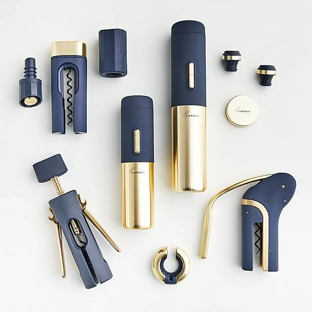
Project Contributions:
Color • Treatment Application • Trend Research
The following four distinct CMF stories were designed for a customer exclusive program with Crate&Barrel. As one of our largest customers carrying the Rabbit line, Crate&Barrel was looking to carry new items in wine that would be elevated in color and finish, justify a higher price point, and be differentiated from their existing products that are primarily black and natural stainless steel.
Inspirations were found in other product categories such as consumer electronics, high end beauty products, and home décor. Colors and techniques range from deep navy with metallic accents to trendy warm tones to speckled black plastic and silicone. The four directions give upscaled options in a well-curated product lineup.
Project Contributions:
Artwork Selection • Artist Contracts and Communication
The artist collaboration aimed to connect Starbucks products with up-and-coming artists. I worked with our in-house team of designers and sales to identify twelve artist with an aesthetic that would compel the Starbucks customer. After further reviewing art and establishing contact with artists, I narrowed down the selection to 4 artists and negotiated contracts that would allow us to propose their work to Starbucks. Examples of artwork were chosen and applied to water bottles to then be shown to Starbucks.
Project Contributions:
Color • Treatment Application • Artwork Manipulation
The following four Star Wars bottles were designed and manufactured as an exclusive line for Williams Sonoma. I selected graphics from artwork that was provided by LucasArts and then adjusted to fit the product. I worked with our operations team and factory to achieve a variety of finishes such as iridescent white, metallic silver and high gloss paint. We went through multiple rounds of product sampling to achieve the desired results to spec.
Project Contributions:
Product Design • Color • Treatment Application • Trend Research
The four lamps shown were designed while I worked at Foreside Home and Garden. I worked closely with the factory on the application process of the ceramic flowers as this was a new technique for the factory. They were very resistant at first, but they were eventually able to achieve the effect and now use this effect on their in-house designs. The lamps were well received at the AmericasMart in Atlanta and quickly sold out.